| WYNK's
creative team thinks outside of the box. We treat each account as
a unique challenge. Here are some of our more interesting approaches. |
 The
WYNK creative team came up with a unique solution: The Secret Plate.
Everyone loves a little mystery so we developed the interest and
the hype by creating this intriguing campaign.
The
WYNK creative team came up with a unique solution: The Secret Plate.
Everyone loves a little mystery so we developed the interest and
the hype by creating this intriguing campaign. 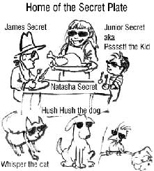


|
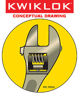
KWIKLOK Invention When the inventor of Kwiklok approached us, he had
this wonderful new concept about the ordinary tool wrench. He only
had a sketch and a lot of explaining to do. WYNK had to catch that
idea and put it down in paper. WYNK did better than just put it in a 2-Dimensional drawing. We felt that the in order to fully grasp the principle and to lessen the need to explain, we needed to put it into animation. The client was very happy with the final result. WYNK spent more time than expected but we made a decision to make his presentation in the best possible way. We put aside the financial loss and were determined to give our client more than he paid for. |
|
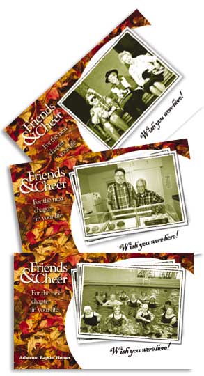
Atherton Baptist Homes Direct Mailing Atherton Baptist Homes, a non-profit retirement facility created to house retired ministers and missionaries, had units available to the public. WYNK developed a 3-punch postcard campaign to disseminate the information. The message was simple --- come and visit Atherton, see the facilities, feel the warmth of the community and, for your trouble, enjoy a free lunch. The first postcard introduced the idea. The next postcard was served as a reminder. And the last postcard gave them the ultimatum of acting now or missing out on a golden opportunity. WYNK helped develop the mailing list. Then we developed the concept of a memorable image --- an approachable senior citizen with a strong mustard color that would help brand the postcard for the different periods it would be received. The campaign resulted in several visitors and a new resident. It was so successful that we created a second mailing campaign with another memorable theme carried throughout.
|
|
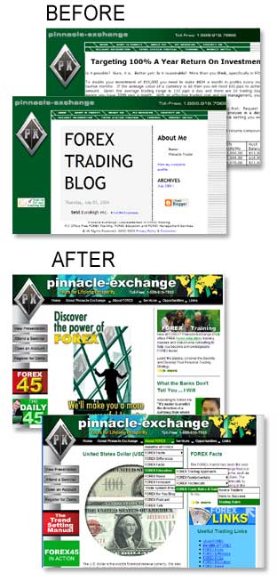
Pinnacle-Exchange Website Makeover Pinnacle-Exchange's website had a very extensive website that was difficult to navigate. We had to re-classify the information ... break the pages down to a more logical progression. The original site was a graphic-based menu and the client was constantly adding new material. We developed a new menu that was programmable to easily add sub-menus. We were targeting new investors who would be learning about Foreign Exchange which could be a very cut and dry industry so we pumped up the site with more lively images to break down the monotony of text.
|
|
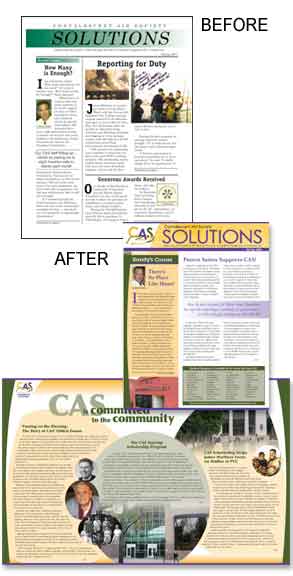
CAS Newsletter Makeover Convalescent Aid Society had a newsletter that was created in an era of early layout programs where gradualy fading backgrounds were cutting edge. The newsletters are mailed out with donor slips and generate funds for this non-profit organization. CAS would normally break even so the only advantage in printing this is PR or promotion. The Board of Trustees was resistant to change. Not only were the type fonts outdated but, in order to cut cost, CAS stuck to a dark green and black color combination. WYNK pushed for a more modern look in all of their material. We revamped the website with a colorful vitality and this was the basis of the newsletter. In our last issue, CAS received $5,000 net of production cost. Needless to say, the Board of Directors are quite pleased.
Excerpt of an actual unsolicited
email: |
|
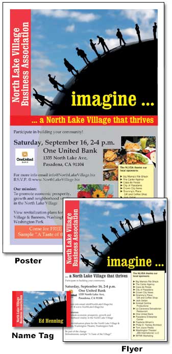
Event Marketing Campaign The
North Lake Village Association is a newly formed association of
businesses along Lake Avenue in the Pasadena area. They have been
trying to get people to join their meetings for several months.
They sent out letters and postcards but they would only get a trickle
of participants. WYNK was tasked to design the postcard for their next meeting with very little lead time. Within a day WYNK submitted a postcard concept that was simple and attractive with a tag line that built interest.
The postcard was so attractive that it was the basis for all the paraphernelia of the event including the flyer, poster and name tags. There was even talk of using this design as the logo for the organization.
The event was packed. It was standing room only. The interest generated sponsors for food, and presentations by neighboring organizations. Local politicians were present and so was the local cable station. This event put the North Lake Village Business Association in the map. |